Design Objective | Branding & Identity Set | Surface & Packaging Design | Infographic
For this design, the concept and ideation were developed for a drive-in theatre called Skylark’s. The drive-in’s branding and identity set would be used in packaging materials that would coincide with the business. An infographic was also developed to graphically represent the history of American drive-ins in a simple yet engaging way to visitors.


Skylark’s Drive-In Theater
Branding | Surface & Packaging Design | Infographic
Design Brief
Skylark’s is an original drive-in theater concept that attracts individuals of all age groups, however specifically targeting 16 to 45 year olds. These personas are typically young adults or families who enjoy a fun evening out.
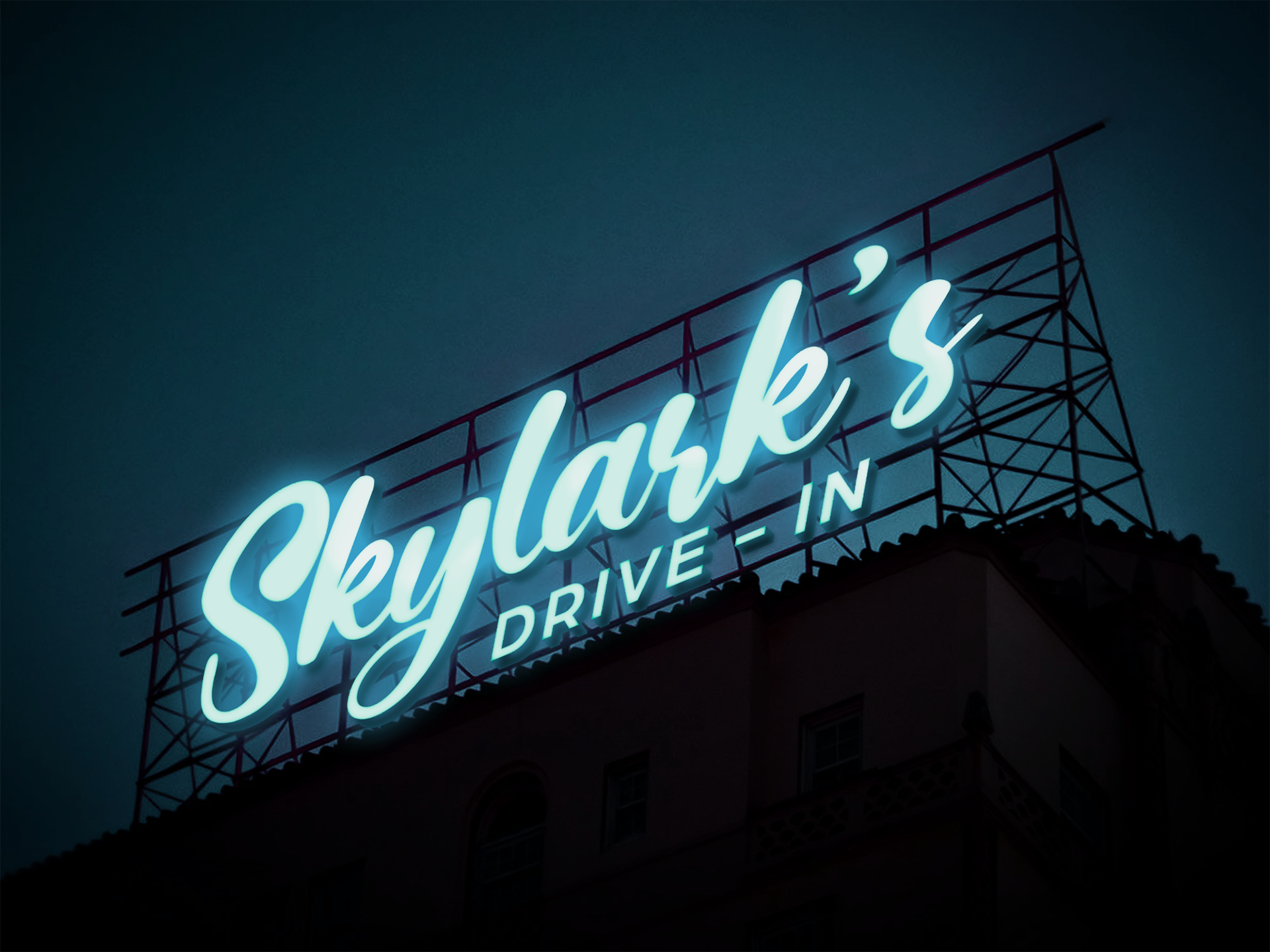
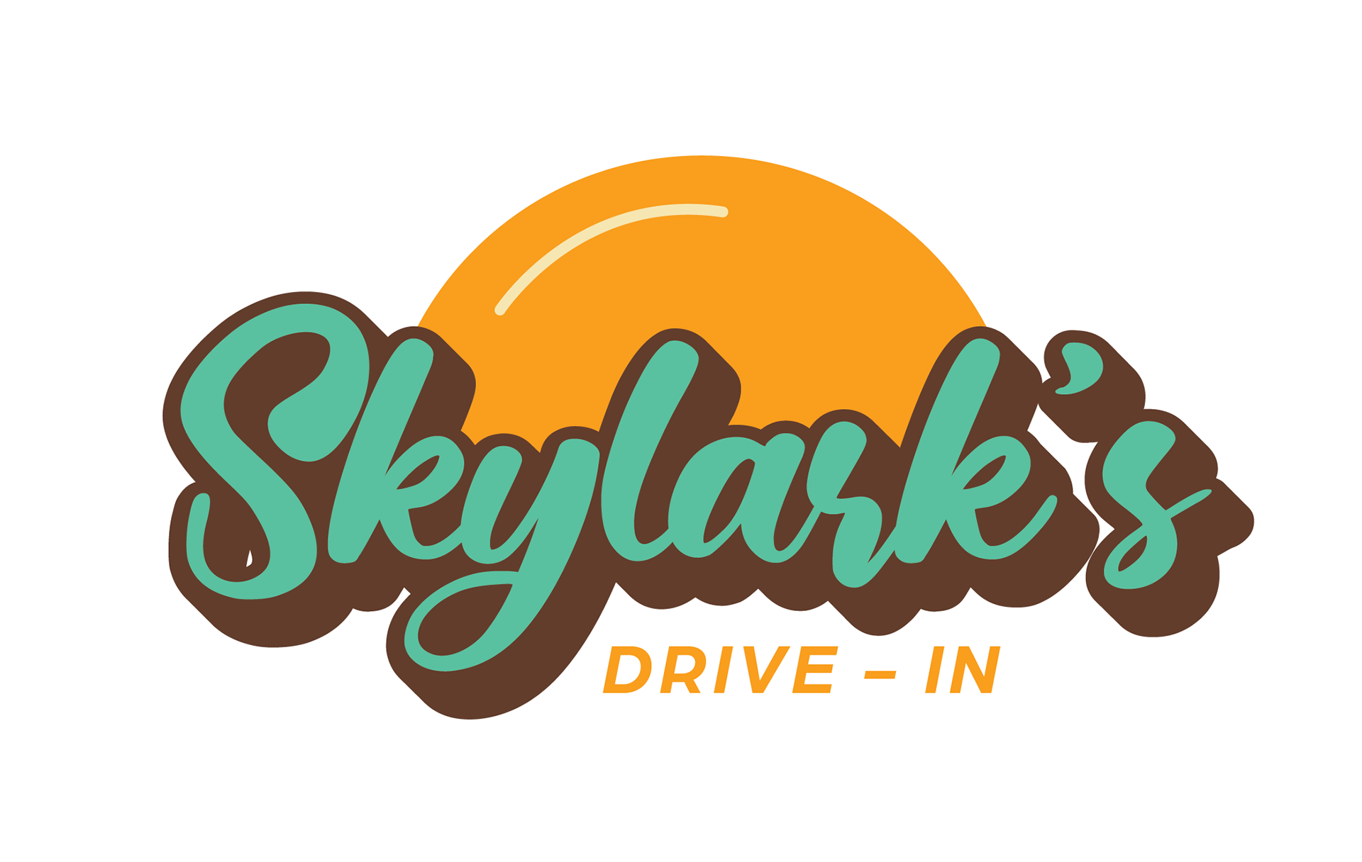
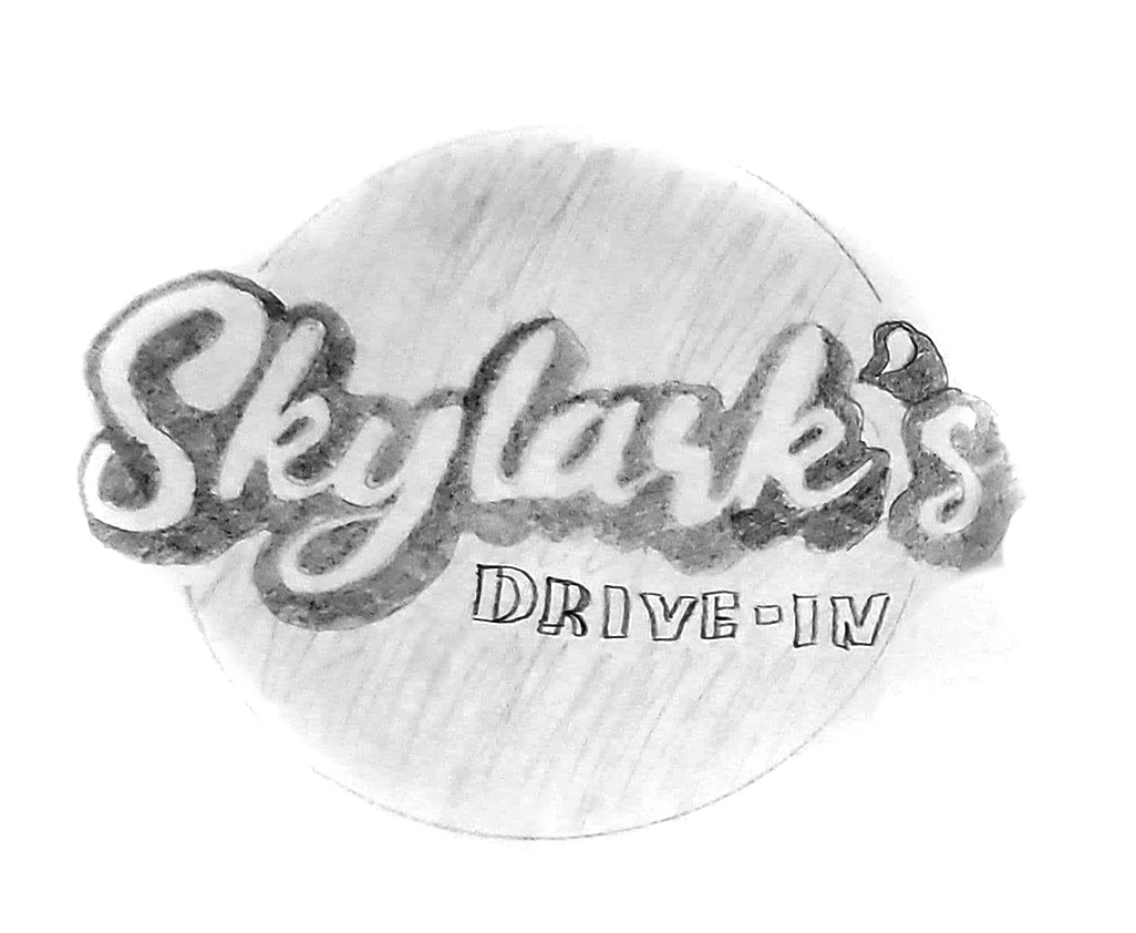
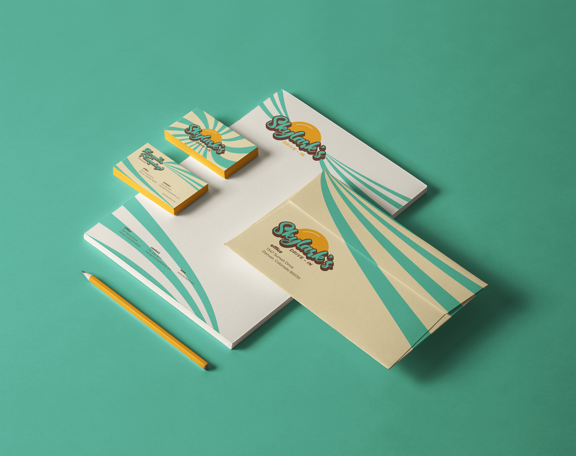
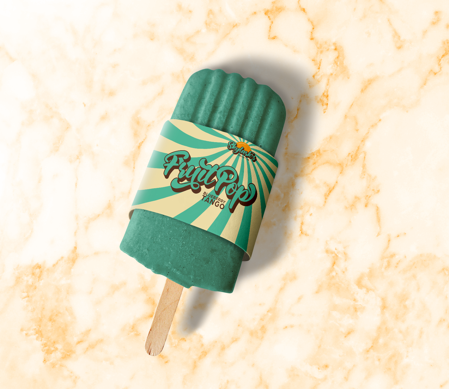
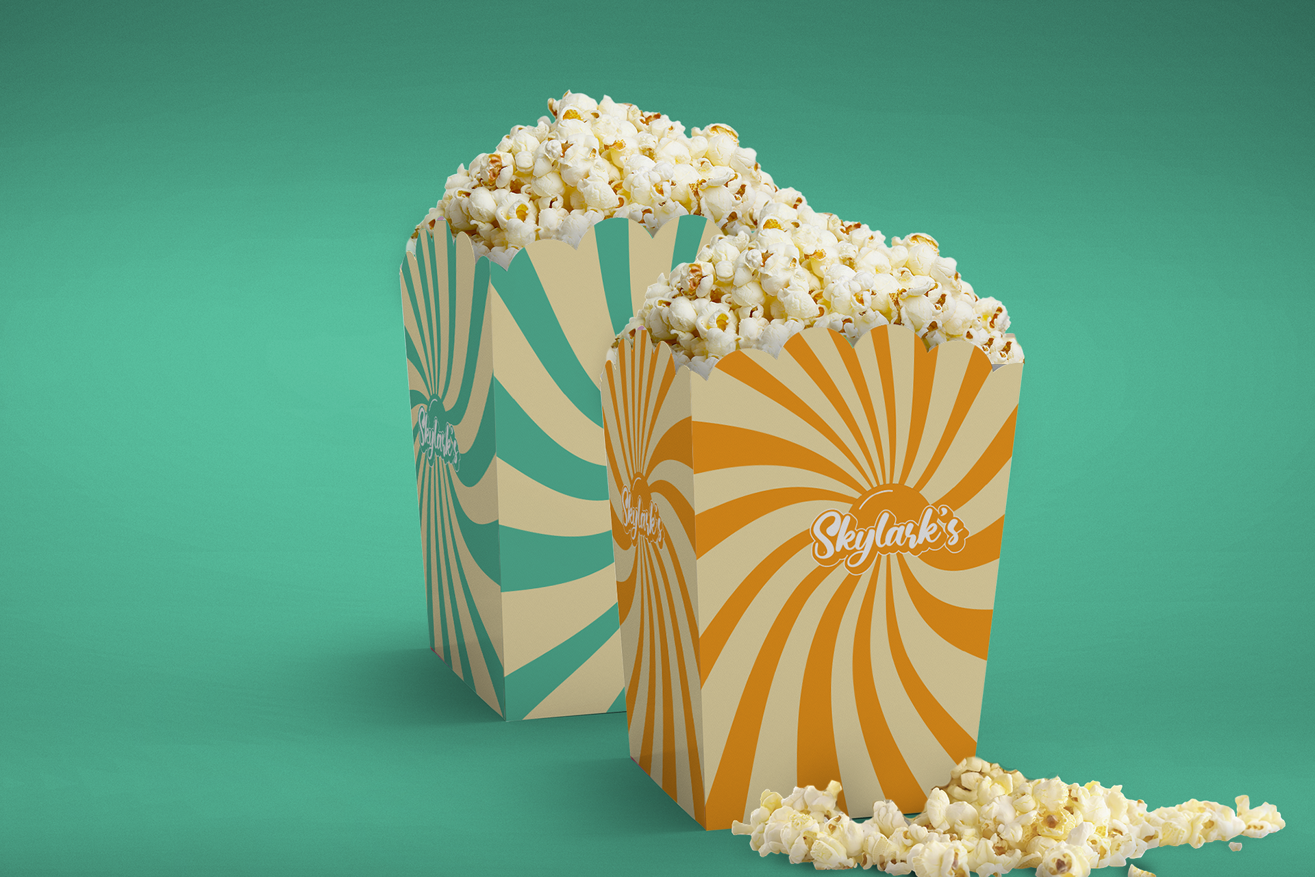
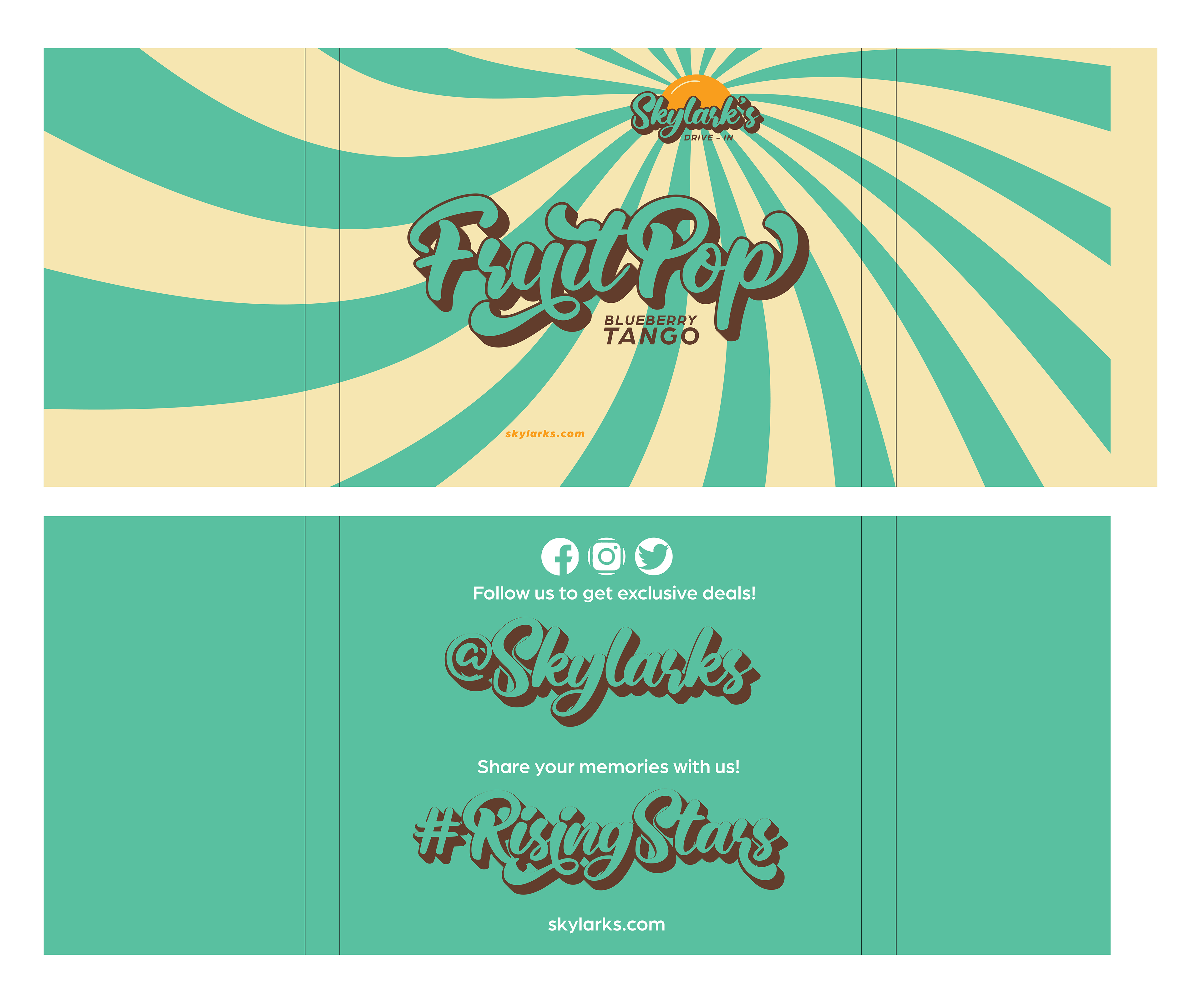
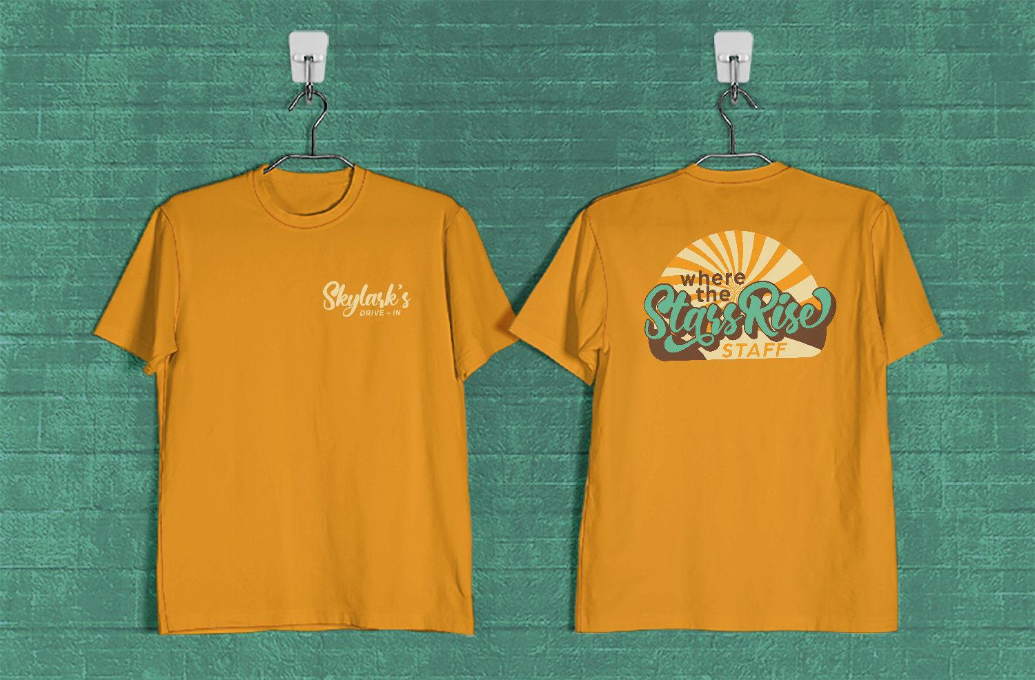
The primary logo for Skylark’s possesses traits from the 1950s that have a retro appeal. The typography used in the primary logo is a bouncy calligraphic typeface with thick strokes and soft curves. The typeface has a thick drop shadow that allows for the typography to have a three-dimensional appeal in front of the mark. The logo mark represents the sunset with a bright orange color. The color palette for Skylark’s has shades of a seafoam blue, bright orange, brown, and beige. A broad and vibrant color palette was chosen to emphasize the retro aesthetic while embracing the past era of drive-ins into the modern world. A tie-dye pattern was created to coincide with the brand’s identity and was used in the expansion of the brand’s packaging materials. These materials will be used at the concession stand for the drive-in.
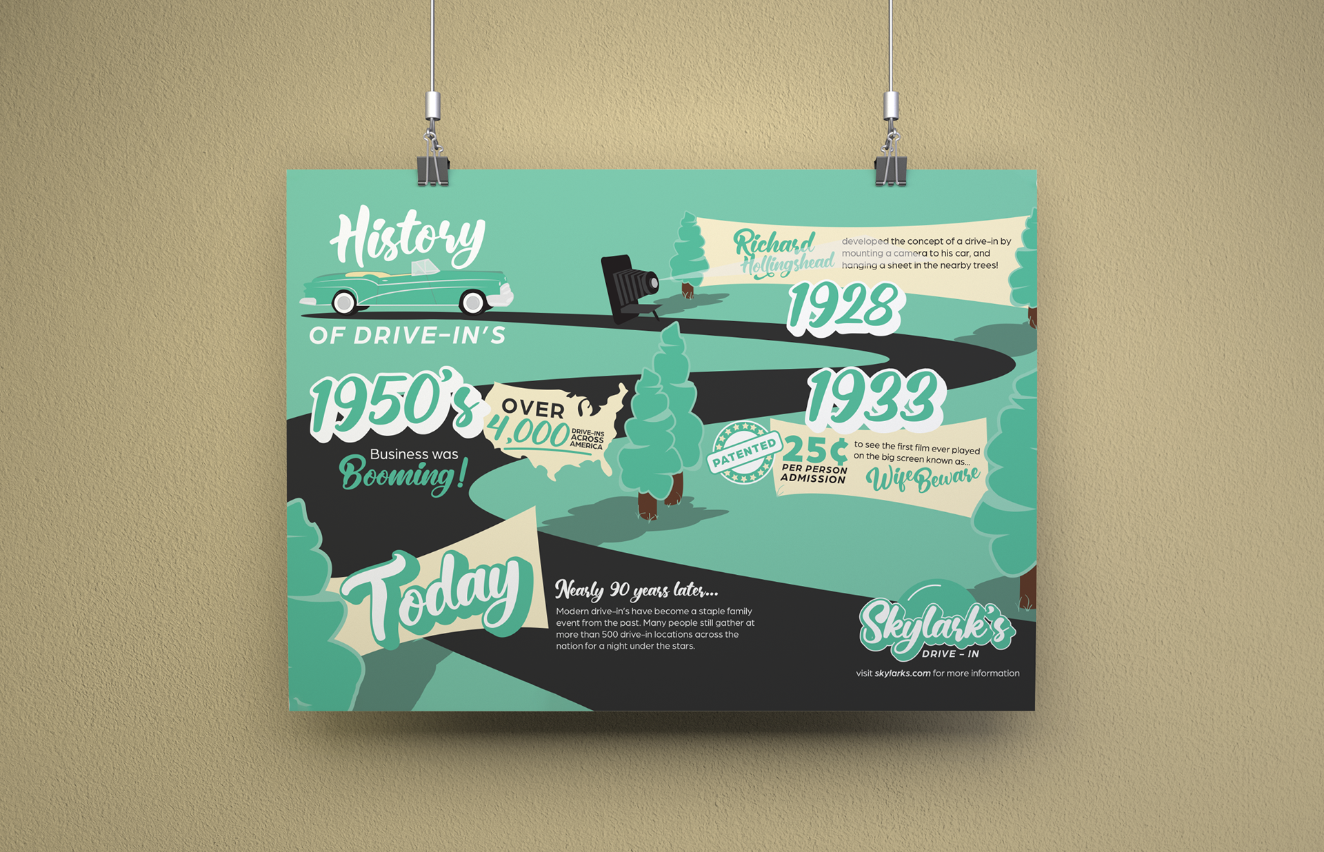
To further elaborate on the historical era of drive-in theaters, the drive-in will be showcasing an infographic. This infographic is illustrative and displays the information simply and engagingly to the viewer. The car illustrates the sense of movement as the viewer is guided down the road throughout the composition.
All of these elements work together to establish the brand and identity for Skylark’s Drive-In, where the stars rise.